LITTLE LOT – IDENTITY & PACKAGING
To create their brand name, identity, and packaging, helping to showcase their wide array of products.
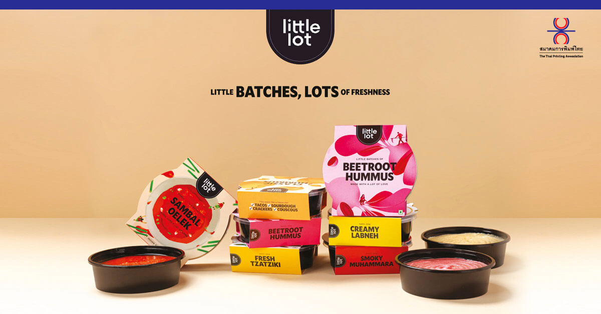
Little Lot is a private label brand by Fresh Aisle, a gourmet grocery chain in Calcutta, India that offers a range of world cuisine products the aim of making gourmet food accessible.
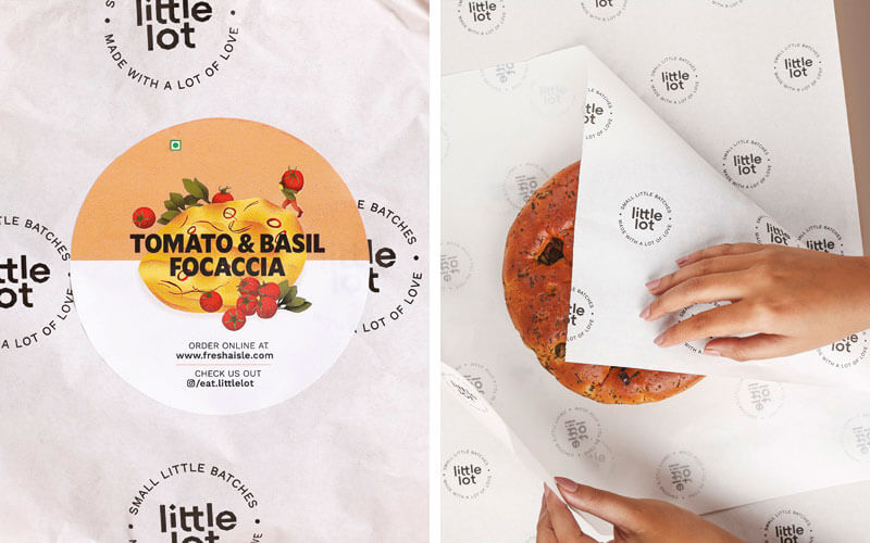
We worked with them to create their brand name, identity, and packaging, helping to showcase their wide array of products. Little Lot’s biggest unique selling proposition is its small batch fresh food. The brand name reflects this concept, and the identity further emphasises the hero ingredients and the individuals responsible for making these products.
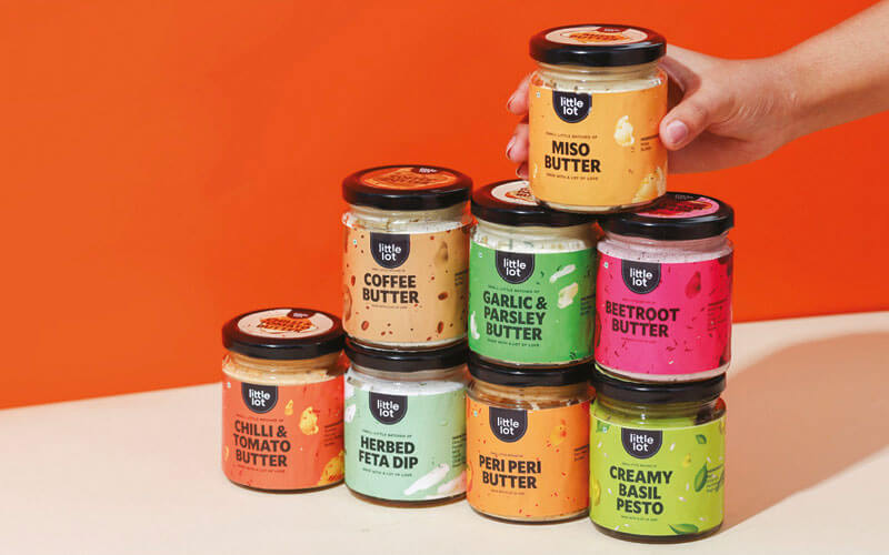
The logo was designed keeping in mind the expansive product range, and was kept minimalist but fun to let the individual products shine.
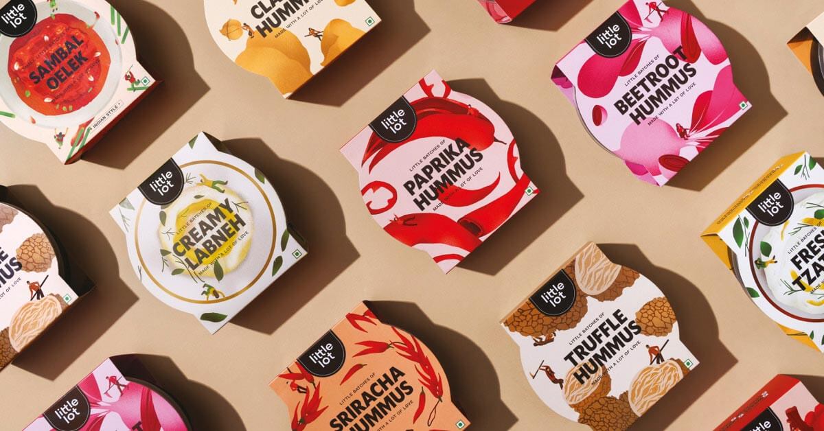
The products featured bold, colourful, appetising food illustrations that would indicate what was inside the boxes and jars. These were deliberately made extra saturated to stand out on shelves and look extra delicious. The accompanying typefaces were chosen with the supermarket setting in mind, with bold letters that would contrast the illustrations.
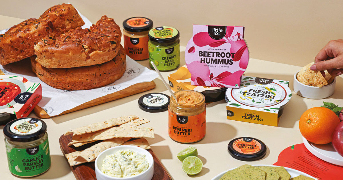
The packaging was done to let the ingredients and product take centre stage and convey that all the products are freshly made. Little Lot’s primary objective was to make gourmet food for everyone, so each product provides instructions on how to incorporate them into everyday cooking and suggests suitable pairings.
Curator’s Insight: We really like the brand name, which captures their essence of offering little lots of delicious food. Their logo is simple but catchy, and it works well with their diverse product range. It has a playful vibe that makes me want to try their products. Their packaging is also very appealing, with vibrant illustrations of the food inside. They look mouth-watering and eye-catching, and they make me curious about the flavors and textures. The typography is clear and bold, and it contrasts well with the illustrations.