
HOUSE OF BROWN BY DENOMINATION
House of Brown welcomes all to the table with striking design by drinks specialist Denomination
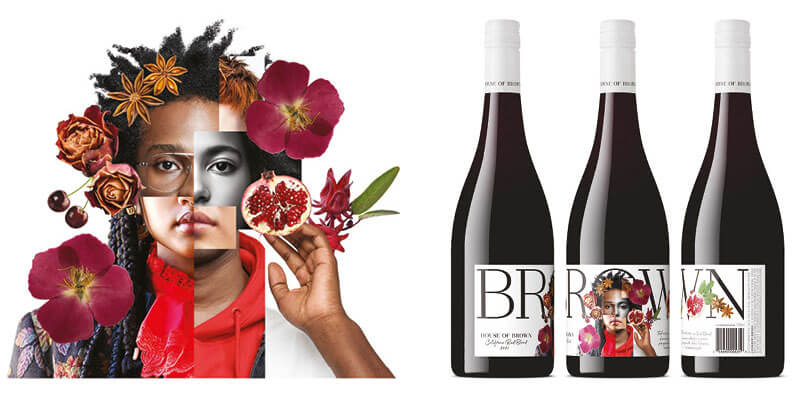
Drinks design specialist Denomination has created an evocative package for the latest wine varietal from House of Brown, the new second label from Brown Estate, Napa Valley’s first Black-owned estate winery.
The design for the new Red Blend allows House of Brown, the second label offspring of Brown Estate, the female-led winery known for its quality and sustainability, to continue its transformation of the drinks market. The human-centric label challenges traditional preoccupations with formality and exclusivity by embedding on the bottle a richly layered homage to the brand’s Come one, come all ethos.
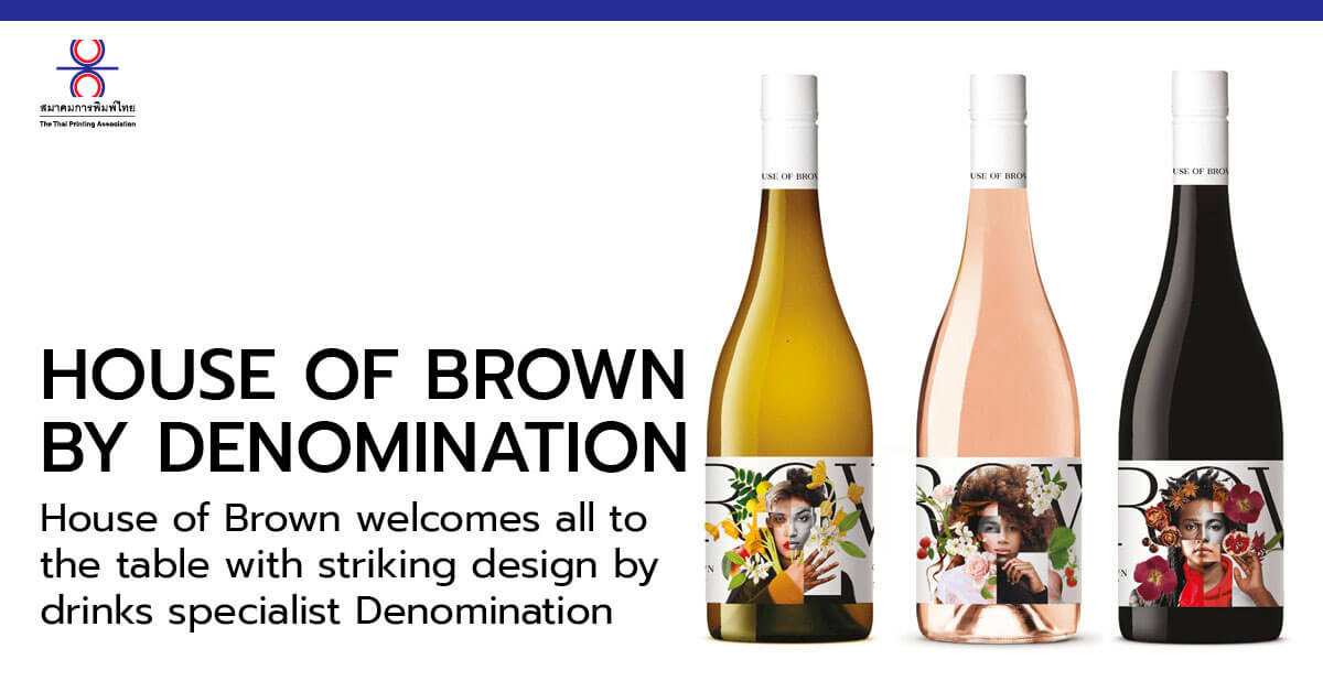
The packaging for the Red Blend continues the brand’s celebration of taste, the acceptance of everyone and the creation of a welcoming community seen in House of Brown’s two other varietals, Dry Rosé and Chardonnay, both designed by Denomination, making waves on the market since the initial launch in 2020.
The mission for these beautiful wines and their design was to extend access to a wine experience that for 25 years has welcomed and embraced an endlessly diverse audience of wine lovers. Adding a red varietal to its range of wine demonstrates the brand’s commitment to welcoming everyone who wants to join their community of wine lovers.
Denomination’s work on this project is a poignant reflection of House of Brown’s own commitment to the values and passion embodied by this sumptuous new brand.
A new world
Traditionally, messaging in the wine sector has centred on exclusivity as a marker of quality, but a new generation of drinkers embrace acceptance, no longer viewing exclusiveness as so appealing. People are increasingly inclined towards brands that represent a broad spectrum of lifestyles, expressions and choices.
Margaret Nolan, Creative Director, Denomination, says: “We were asked to instigate a House of Brown ‘movement’ by designing distinct, stand-out packaging that evokes a sense of belonging.
“These are values that consumers are finding increasingly important. People care what their drinks choices say about them, and picking a House of Brown bottle to share with family and friends needed to communicate a modern perspective on society – welcoming, accepting, contemporary – as well as a discerning palate and appreciation of great quality”.
Representing different values
Denomination saw that people needed to be at the heart of the brand design, but carefully balanced with representation of the quality and flavour of the wine.
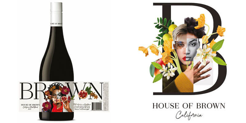
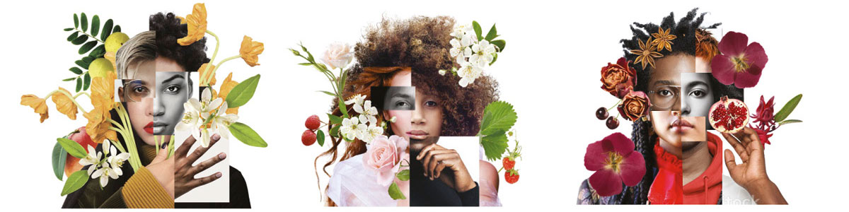
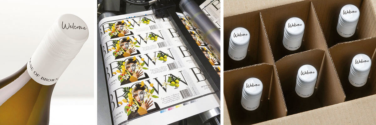
To achieve this, the label takes sections of images of people of different genders and ethnicities, using collage to form a universal whole. The profile is surrounded by beautiful imagery to signify the flavour notes that you can expect to detect in a particular wine. And the capsule amplifies the brand story with the word ‘welcome’. The result is a spirited invitation to enjoy House of Brown wines.
Deneen Brown, President of Brown Estate, says “There is no ‘other’ at the House of Brown. Hospitality is at the heart of everything we do, and we love Denomination’s visually arresting interpretation of our principles.
This stunning and innovative packaging is a powerful platform for growing House of Brown’s audience, and the ‘human x nature’ collages embody an expansive brand identity that knows no bounds.”